
Strum Pattern
I discovered this site while learning to play guitar. As a gratitude for the valuable free information, I have updated the website design. I assembled everything from scratch: layout, and visual identity, and created illustrations. Since I've been using this site for quite some time, I've realized what needs to be changed to ensure the most comfortable experience.
(re) Branding
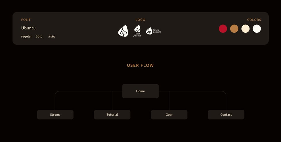
User flow
Wood colors (like guitar).
Logo in the shape of a mediator (the thing with which the guitar is strummed).
Simple, reduced navigation.
Illustrations
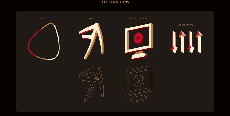
Colorful, contrasting.
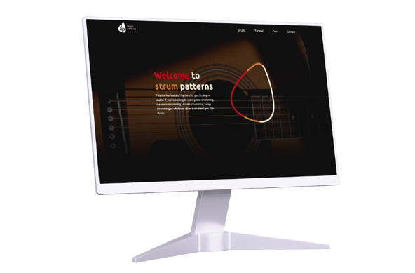
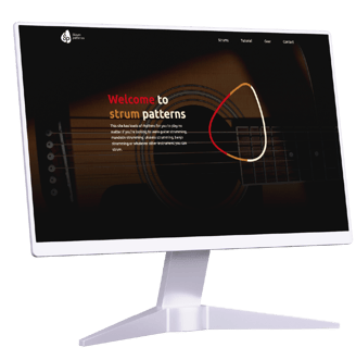
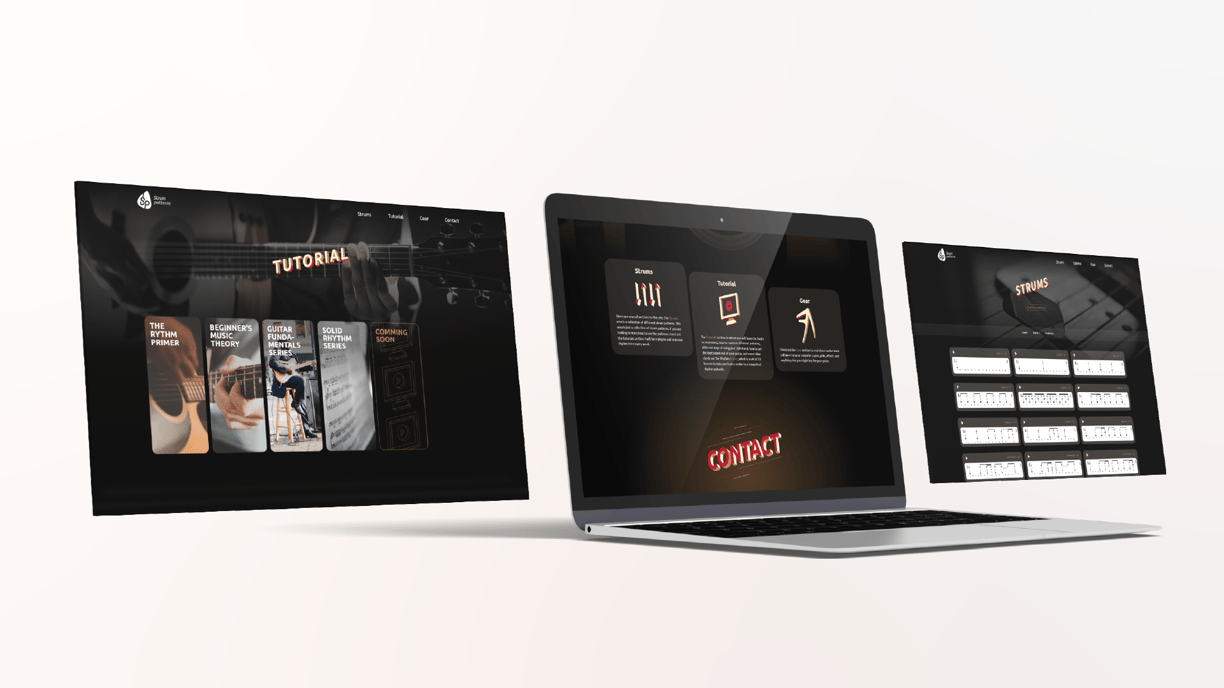
Home page
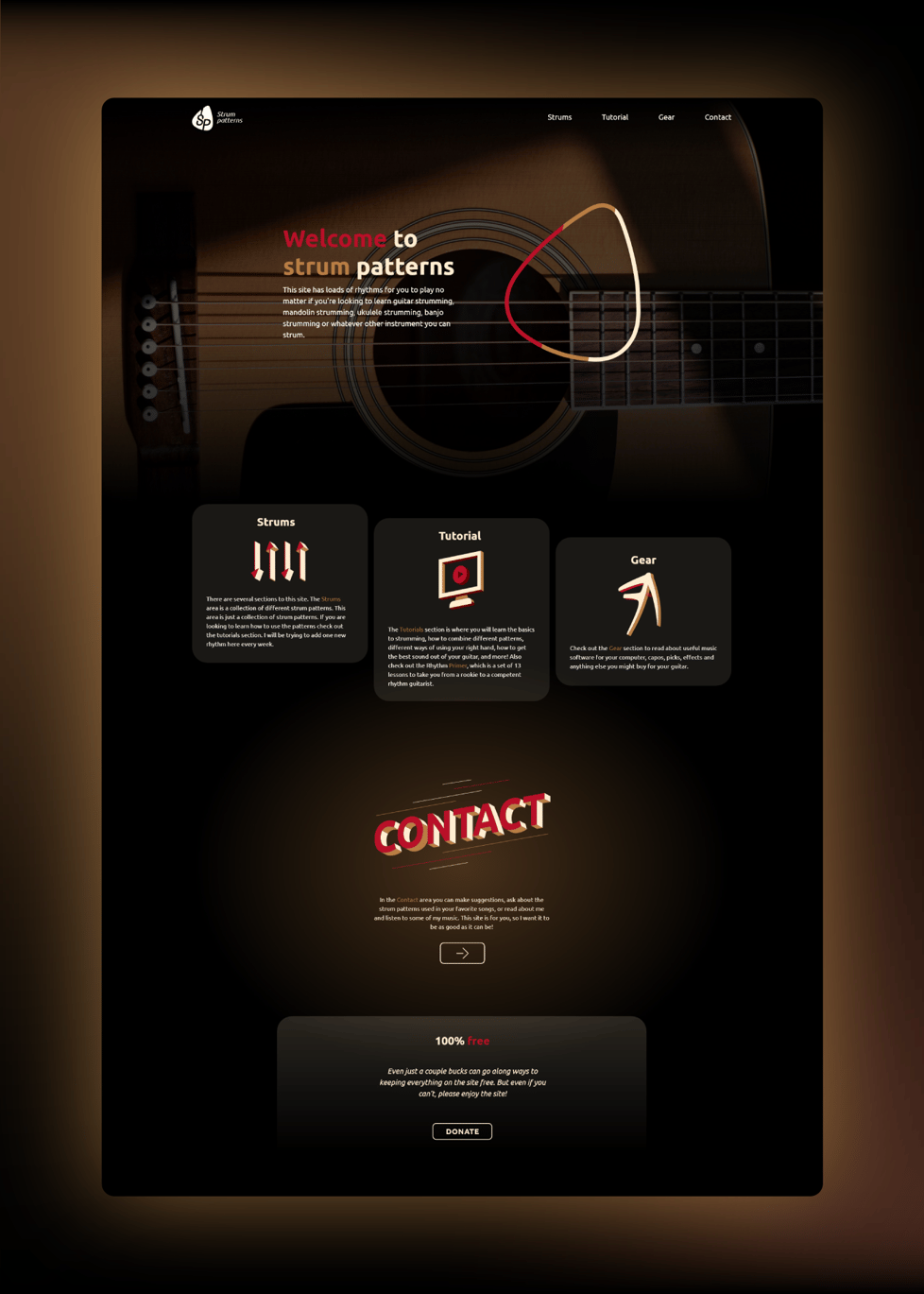

A spacious site with an organized hierarchy.
Eye-catching titles.
Strums page

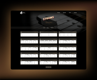
The most used page.
A wide selection.
The key to fast search - filter.
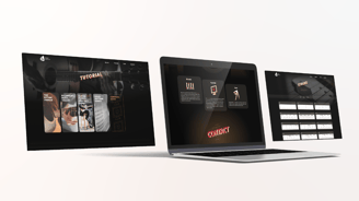
Tutorial page

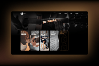
Beautiful looking tutorial cards.
Gear page
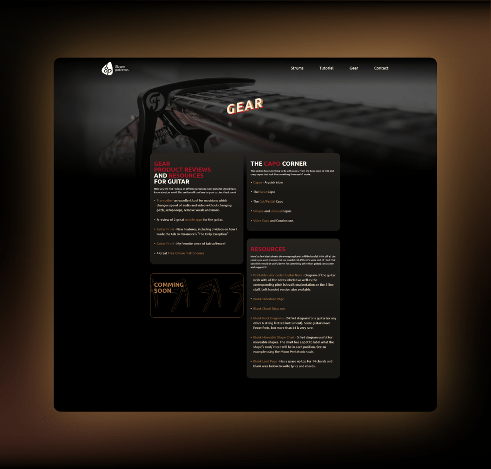

Lots of information in one place. Certain words are highlighted and linked to other pages.
"Coming soon" card.
Contact page

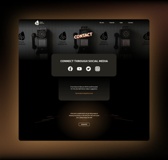
Nothing unnecessary.
illya.stolyachuk98@gmail.com +370 626 44409